Quantitative Analysis of MPI Procedures
QPS and QGS
- The images presented in the lecture is an attempt to assist the student in the understanding how MPI data is quantified
- One of the more popular programs that is Cedars Cardiac Suite (QPS/QGS). The rival to this program is Emory ToolBox. We will discuss both programs in detail
- In addition, you might find several other programs that are out there and available and they deserve honorable mention: 4D-MSECT and Baylor polar map
- Essentially the application of these programs are applied after the raw data (cine) has been acquired. While FBP can be applied without these cardiac programs, it is not suggested. Cedars and Emory Toolbox can further enhance your diagnostic accuracy
- Hence the quantified data may reveal more elusive information and further define the severity of disease
- It is important to realize that when the physician looks at the raw data/tomographic data, he/she is evaluating the information in a qualitatively format - just looking at the displayed information. However, with the aid of digital imaging and computer processing, quantitative analysis of the myocardium can be achieved, further improving our diagnostic capabilities
- Is one quantitative program better than the other? Check this article out and expected to discuss it in class: "Quantification of Left Ventricular Volumes and Ejection Fraction from Gated 99mTc-MIBI SPECT: MRI Validation and Comparison of the Emory Cardiac Tool Box with QGS and 4D-MSPECT"
- MCV uses Cedars-Sinai's Cardiac Suite. Let's look at some of the the details
QPS - Quantitative Perfusion SPECT
- QPS is applied on rest and stress data, with the purpose of evaluating the SPECT perfusion data. This portion of Cedars does not evaluate wall motion
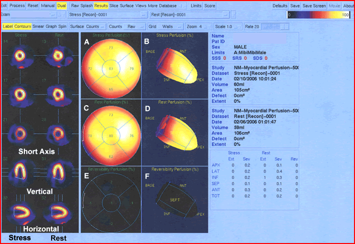
- From the images above the left side displays short axis, horizontal long axis and the ventricle long axis
- The vertical and horizontal long images are displayed at midpoint of the LV
- The set of three green lines seen next to the vertical and horizontal long images mark the different sections that display the short axis
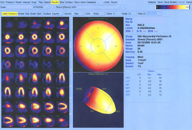
- Polar maps of the stress/rest regions are displayed
showing radiopharmaceutical uptake throughout the LV. Each labeled image (A - F) is identified
below
- Shows perfusion stress distribution throughout the LV. Variations in tracer distribution will show changes in color. This occurs as SD of the mean pixel increases
- Represents the same distribution seen in A, however, it is the shape of the LV. This image can be manually rotated to evaluate LV at different angles
- Is just like A, however, it shows the polar map at rest
- Is similar to B, showing radiotracer uptake during rest
- Displays a polar map identifying any reversible perfusion. The larger the area and the greater the color change defines increased severity of ischemia. In our example no ischemia is present because all the pixels are black
- Represents the shape of the LV and correlates with the data in the previous map
QPS - Stress vs. Rest
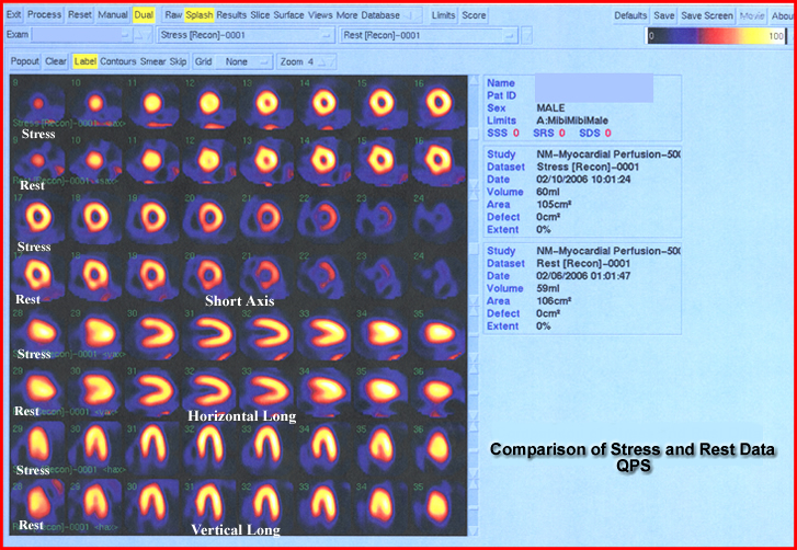
- Display of the rest and stress images are essential in determining the presence of disease
- These images are reviewed and compared to the polar maps
- If there is an area of ischemia or infarct correlation is essential and should be seen in at least 2 different tomographic views
- Changes in uptake can also be due to artifacts and not disease. For this reason always evaluate your raw data (cine)
- Short Axis / Horizontal Long Axis / Vertical Long Axis are displayed
- This information is best defined as more qualitative than quantitative
QGS Quantitative Graded SPECT
- Left portion displays the SPECT slices of the LV
gated during stress
- While these images are seen in this static display, these images are actually moving in cine a mode
- Each slice represents the different slices within the short axis, horizontal long, and ventricle long
- To the right of the slices are polar maps with color change indicating possible presence of disease
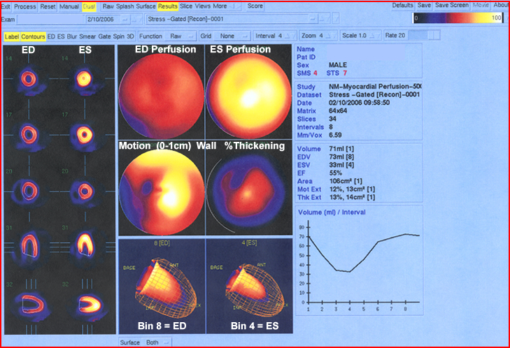
- The last set of images evaluate wall motion
- Far left
images
- END and ENS display the two extreme components of the cardiac cycle
- The evaluator looks for brightness (thickness) to determine the degree of contraction
- Areas that lack contraction or reduced activity indicates disease
- Center
images
- First set of polar maps show percent perfusion at END and ENS
- Second set of polar maps show
- Cardiac wall motion will display 0 to 1 cm thickness. The greater the color intensity the greater the motion
- Percent thickening is shown as a map where the degree of wall motion is indicated by the amount of color change
- END and ENS are displayed showing the varying size of the LV chamber
- Far right
images
- Statistical data is seen
- Volumes are displayed
- Thickness and wall motion and its percentages are stated
- EF and curve is calculated and displayed
- EF = 55%. Anything below 50% may be defined as disease
Case Presentation from the APSNC website
Fifty-four year old male 54 year old Asian man was presented with SAO for the past 3 months and is classified as overweight, having having mild hyperlipidemia. There was no history of diabetes, hypertension, or smoking. An MPI exam was ordered and the information is displayed below. The EKG was unremarkable.
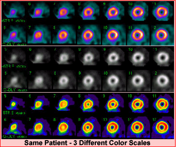
Three different color scales are represented for your review of the short axis rest/stress data described. Several comments should be made regarding these short axis images
- Displaying the short axis in three different color scales gives the reader a better perspective of radiotracer distribution within the LV. Sometimes defects are better seen with certain colors tables when compared to other color tables
- When a technologist sets up the images for display one should always "line them up" so that the same part of the stress wall matches the same part of the rest wall
- These set of images essentially show normal distribution of the radiotracer with no perfusion defects.
- It is the gated data that fines disease! Where an EF, 35% indicates then presences of cardiomyopathy
- This is a good example of why gating is so essential
- First point to consider is that when there is decreased thickening on a gate study disease is usually present
- In this example thickening is noted, however, there is a reduced ejection fraction which finds the disease cardiomyopathy
- Ironically, if the SPECT data had not been gated, cardiomyopathy would not been discovered
Emory Cardiac Tool Box (ECTB)
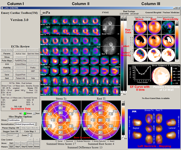
- After process of a MPI procedure the user selects ECTB to quantify the data. The above display loads up the patient's information. This material will be reviewed by separating the above display into three starting
- In column I - Look at the center, just below ECTB review. Here is where the visual display is set and specific information is identified: cardiac volumes, EF, and 17 segment sum scores
- Column II
- Stress and rest cine (B&W) data is displayed in the far right corner. Images should be evaluated for quality and possible artifact(s). Note the line in the center of the acquired data. This helps the viewer determine if there is any patient motion
- Short axis, horizontal long axis, and vertical long axis are displayed where stress and rest images can be compared
- In the lower portion, where the polar maps are seen also show summed scores. Each map contains 17 segments
What do these scores mean? Levels of hypoperfusion are noted in the polar map which is based on the activity to the mean pixel. SDs are calculated with relationship this mean and as the amount of activity egress its value goes within each segment goes up, maxing out at 4. In addition, you can look at the how the shades of color egress as, the amount of activity degrees. This again relates to the SD variance
- Color coding is based on 7 levels each representing one SD
- White means that there is less than 1 SD
- Black demonstrates the maximum amount of SD changes
- A score of 0 - 4 is given, where 0 presences white (normal distribution) and 4 represents black (complete lack of activity). As activity in any given segment deceases its numerical value will increase up to 4
- Severity score is generated by summing the 17 segments
|

|
- Column III
- Nine polar maps compare stress, rest, and reversibility data. This further helps determine the severity of disease
- To calculate the reversibility map the following information is processed
- Normalization of stress/rest occurs by finding normal distribution in a 5 x 5 voxel area in stress and rest images
- A ratio of stress to rest is calculated the value is then multiplied with each pixel in the rest data
- Therefore normalization occurs by adding counts to the rest data
- Then rest counts are subtracted into the stress data and reverse redistribution is displayed
- Viability is quantified by
evaluating distribution of of the radio-tracer in the resting images
- Viable segments show perfusion, while segments that lack activity, lack viability
- The area of maximum counts is determined and anything that falls below 60% is considered nonviable
- In the center there are two components
- EF curve - is calculated from the the amount of empty pixels within the LV chamber from each bin (usually there are 8 bins, however, some departments use 16 bins in their gated protocol). To find more detail on EF calculation click the link
- Percent of myocardial wall thickness is displayed in color where the greatest amount of movement occurs ≥40% (white) to little/no movement ≤
10% (green)
- In the lower right section displays the LV in a 3D format where stress and rest are can be compared at different angles. Changes in color indicate different degrees of abnormal perfusion
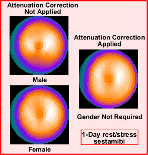
- When a polar maps is seen in a cardiac procedure it is important to understand how a "normal database" is created and who it is used and compared with the processed data. In theory, this comparison will be identified and prevent a false reading. As an example consider breast attenuation. So how does one generate a "normal" database? (it requires three groups of patients)
- The first group contains approximately 30 patients that have a the low probability of cardiac disease. To determination low probability an alternate diagnostic method (other than nuclear cardiology) must be applied to determine the patient's probability
- Second group contains around 60 patients all of which have a variety of perfusion defects
- A third group contains about 60 patient collected from multiple imaging sites, all of which have undergone cardiac catheterization for the correlation of disease. This last group is considered the validation group
- These 150 patients comprise the MPI "normal database"
- If the acquisition does not include attenuation correction then two groups have to identified in the program, male and female. Why?
- If the imaging system system has attenuation correction then only one normal data base is needed
- A closer look to gating the cardiac cycle
- Myocardial thickening in a gated image is an indication of regional and global myocardial wall viability. In addition, it allows for the calculation of cardiac ejection fraction
- Let's take a closer look at myocardial wall thickening and how it is determined
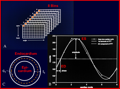
- First point of interest is to realize that there are two problems with imaging wall motion
- First is the limited spatial resolution of our imaging system in that the myocardial walls may fall below the systems spatial resolution (this will more likely occurring during ED phase of the cardiac cycle)
- Second is the effects of partial volume which can compound the issue of limited resolution
- Processing with limited resolution
- Most cameras resolve to around 1.0 cm
- The size of the myocardial wall at ED is usually less than 1.0 cm
- Myocardial wall thickens as the heart moves through its cardiac cycle, in essence the wall gets thicker and come into the systems resolution, as the heart contracts towards ES
- With the effects of partial volume the wall's increase in counts in an almost linear fashion till it reaches ES
- ES size is determined/measured allowing us to extrapolate back to the size of ED
- As the cardiac cycle continues the heart wall begins to relax, preparing for the next QRS complex. This is considered predictable
- There is an assumption that counts are doubled at ES and 1/2 that at ED.
- The same can be said for the size of the heart where the size is reduced by 1/2 at ED
- Therefore, thickness can be calculated. As an example, if ES is determined to be 1.4 cm then ED would be 0.7 cm
- Amplitudes of the phase graph shows the cardiac cycle and helps to further define temporal resolution by giving further efficacy to wall thickness
- Endo/epicardium calculations assist in determining the volume within the LV chamber, hence allowing for %EF calculation
- From determination of LV volumes, LV mass is quantified by multiplying the voxel volume (those voxels lacking activity within the LV chamber) by the specific activity of water
- Phase and Amplitude analysis are determines by dyssynchrony within the cardiac cycle
and is discussed below
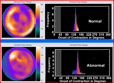
- Evaluating the cardiac contraction via this method is completed with a process known as Fourier Analysis
- At the Onset of Mechanical Contraction (OMC) of the LV, the peak of the R-wave and 3D counts synchronized to the 8 bins of the cardiac cycle's and associates with the short axis
- Past the 0-degrees, the LV starts to contract with the colors of the short axis match the colors distributed within the phase peak demonstrating cardiac motility
- After the phase peak dissipates it eventually reaches 360-degrees at the end of the cardiac cycle, establishing the R to R interval
- Five components go into determining phase analysis of the cardiac cycle
- Peak phase - most frequent phase in response to the displayed histogram
- Phase SD - distribution of the phase (the SD of the phase)
- Phase histogram bandwidth - elements of the phase being distributed along the cardiac cycle
- Phase histogram skewness - indicates histogram symmetry. Increased skewness from left or right of the peak indicates an extended contraction or relaxation
- Phase histogram kurtosis - degree of peakiness or the shorter the bandwidth. The higher the peak, the greater the kurtosis
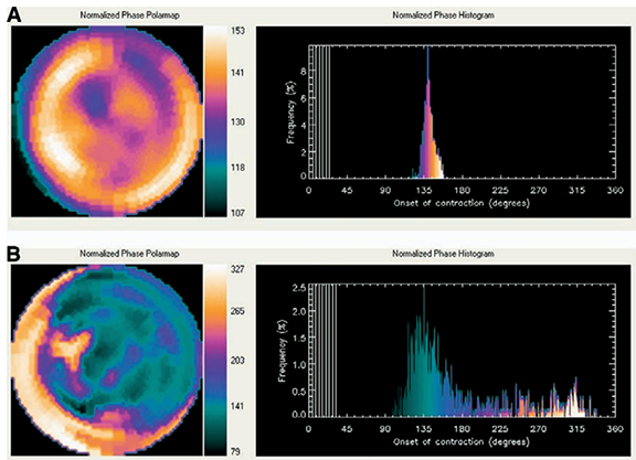
- An example of a normal and abnormal polar map with comparision of phase amplitude images
- Given the above data compare normal to abnormal
- Note the bandwidth and change of color within the peak
- Compare this to the color of the polar map to the color of the phase histogram to evaluate the difference between normal to abnormal
- Normal
- Display the array and blending of all colors as a heart wall contracts
- Skewness of the histogram should be symmetrical
- Kurtosis is greater with the normal phase peak
- Bandwidth should be small
- Here are some more examples of phase/amplitude with applicaiton of MUGA - dynamic blood pool movement - link
- Another look at a MUGA
 &
&
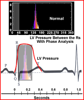
- Comparing R to R, Phase, and LV pressure
- LV pressure is shown as a red line that starts at the Q-wave, plateaus at the S wave and then starts its descent as the T wave begins to build
- I've blended the phase peak and LV pressure to show how LV pressure, QRS pulse, and phase peak occur in a normal cardiac cycle
Return to the Top
Return to the Home Page
3/22
Automated Quantification of Myocardial Ischemia and Wall Motion Defects by Use of Cardiac SPECT Polar Mapping and 4-Dimensional Surface Rendering*
Interpretation and Reporting of Myocardial Perfusion SPECT: A Summary for Technologists*
My thanks to people at Emory for giving me to use their images/materials to demonstrate some of the components within the Emory ToolBox. Article entitled, The increasing role of quantification in clinical
nuclear cardiology: The Emory approach by Ernest V. Garcia, et.al.