Ludwig Mies van der Rohe - by Joseph Chen
|
Ludwig Mies van der Rohe, one of the most influential and certainly the most emulated "modern" architect of our time, was born in Aachen, Germany in 1886. As the last significant architect from the Bauhaus movement in Germany, Mies was tremendously influenced by its philosophies of synthesizing aesthetics and technology. Shortly after the closing of the renowned design school in 1933 due to the fascist uprising, Mies would come to America to assume the position of the head of Illinois Institute of Technology's Department of Architecture. It is in America that he will build on his philosophies of construction from his previous works in Germany, and manage to create a distinct form of architecture that will revolutionize the modern city. For Mies, it is not about inventing new forms or building as an expression of art. Rather, it is his goal to evolve a clear and austere structure, firmly grounded by the principles of architecture, and to stay consistent to the form of construction. As part of the Bauhaus influence, Mies understood the importance of technology, and demanded that a design must reflect the means and methods of the time. For architecture is the interpretation of a happening in history, and so Mies sought to express the driving forces of our era. Meanwhile, his designs always express a practical aesthetic, a beauty that serves its inhabitants. Subjective and merely decorative trimmings are shunned to allow the structure to articulate the grace inherent in itself, and refinement is conveyed by the minimalism and vibrancy of the materials. It is through these objectives that Mies erected his projects, some of the most beautiful and lucid buildings around the world, that has helped to define the very essence of simplicity and modernity for the 20th century. |
While Mies' designs are often based on his previous works, in the sense that his brand of architecture is a work in progress, his project are constantly changing due to the introduction of new concepts and realizations on his part. It is therefore difficult to completely differentiate between his projects, because they all do share so many similar characteristics. Nonetheless, it is still possible to categorize Mies' career by the main types of designs, which we can define as: Structure vs. Space-Definition, Glass and Steel-Skeleton, Suspended Roof (also known as the "Clear Span Buildings"), and Steel-Frame with Glass Curtain. Each of these designs reflect the development of previous ideas, an evolution of building that Mies called the search for "order and truth." Even as he insisted that architecture is bound to the epoch, as part of his belief that a design should reflect a period of time, his influences on our way of thinking and living will certainly last for much longer.
|
Structure vs. Space-Definition
|
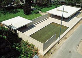
After France and Britain decided to build national pavilions at the International Exposition at Barcelona in 1929, Germany commissioned Mies to prepare a design as well. And so, he created the renowned German Pavilion. (Most historians and various architectural texts often refer to this project as the "Barcelona Pavilion," which is not entirely correct as it was really the German Pavilion in Barcelona.) Its purpose was merely to look worthy of the country it represented, as well as to accommodate the German's reception of King Alphonso XIII and other government functions. The Pavilion was disassembled shortly after the Exposition. However, due to the significance and tremendous influence of the design, it was reconstructed according to Mies' plans on its original site in 1986, for posterity and other Mies enthusiasts, by architects Cristian Cirici and Fernando Ramos. |
|
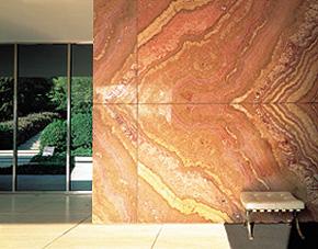
The German Pavilion was especially significant and revolutionary because here, Mies challenged the accepted belief that walls must support a building. It seems that during this time in his career, Mies suddenly became aware that structural elements and space-defining elements could be entirely separate entities. The Pavilion stands on a terrace with two pools, one partly roofed. It is consisted of two horizontal planes: the roof held above the raised terrace. The marble and glass walls, freely placed between the two planes, are set free of structural obligation. Instead, the roof slab of the house is supported on eight steel, cruciform columns, encased in chromium covers. The glass walls of the Pavilion were not used to enclose, but rather, to open the house to its surroundings. There is a flow to the structure so that no area is closed, but rather, each area becomes a natural part of adjacent sections of the house. Visually, it was not a compartmentalized plan; instead, the separation into rooms was sensed by the individual. A variety of precious materials, marble and onyx walls, travertine-faced podium, tinted glass, also helped to bring a certain ambiguity and poetry to the airy Pavilion. |
|
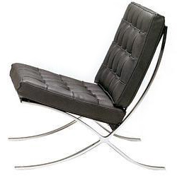
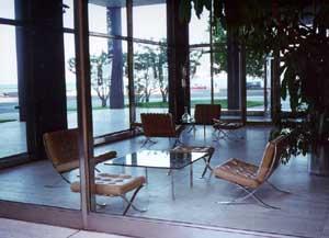
Mies wanted to use furniture in the Pavilion that would complement the building while not blocking its spatial flow by being too solid. And so, he designed his own, which came to be known as the Barcelona chair, stool, and table. The chairs were flat chromium-planted steel bars upholstered with cushions of white leather. The tables were topped with slabs of black opal glass. While the furniture appears to be very industrial and machine manufactured, they are actually almost entirely handmade.
|
|
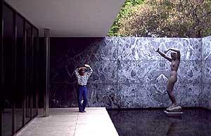
Non-load-bearing walls in marble and
glass are used to segment the interior, yet not enclosing it. The glass
wall visually opens the Pavilion to the surrounding pool.
|
| With the Barcelona Pavilion, Mies defined a new kind of space, a free and open plan. Structure and space were integrated, proportions and materials were brought into harmony, and a new expression of structure versus space was born. The concept of structure vs. space-definition for the pavilion would go on to influence Mies' later designs. | A later project, the Tugendhat House (1930), would use the similar elements of precious materials for non-load-bearing walls, steel columns for support, and a spatial flow that was not limited by compartmentalization. The Farnsworth House (1946-1950) also shares some of the constructional details as the German Pavilion, although its extensive use of steel and glass walls reminds of the Lake Shore Drive apartments as well. |
(In 1934, Mies actually went on to design a second pavilion for Germany for the International Exposition in Brussels, as a part of a competition that the Nazi regime held where they selected a winner among the submissions. However, due in part to the political atmosphere and part to the strict guidelines for the contest, which forced Mies to include such elements as huge, tacky flags of the swastika in this design, he was not picked for the project. Shortly after, Mies would leave Germany to begin a new career in America. |
|
Glass and Steel-Skeleton In 1946, Mies met Herbert Greenwald, a builder and real estate developer. Together, they would raise three high-rise apartment buildings. These were to be Mies' first realized high-rise structure. Here, Mies expanded his idea of the "glass wall," as previously seen in the German Pavilion. Mies' vision of the steel and glass frame offered a previously unknown visual experience, because in his version, there are no limits to space as seen from the inside of the apartment. The walls of the apartment buildings would be entirely glass, from floor to ceiling, interrupted only by steel or concrete beams for support, so that the occupants would feel liberated and detached from the earth. To achieve the optimal space for an apartment building, Mies planned the typical floor with a central access corridor, surrounded by a ring of accommodation (elevators, fire stairs, service shafts, as well as the kitchens and bathrooms). The peripheral unimpeded area is then available for subdividing into living spaces. The ground floor of the complexes was kept as open as possible. Only the elevators, fire stairs, and service shafts are the solid elements, while the remaining space is used as entrance lobby and lounge. The ground floor is high, usually 16 feet, with the enclosing glass wall set back from the building's perimeter, making the entrance more inviting. |
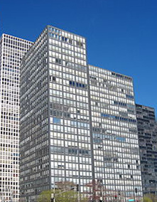
Front view of the Lake Shore Drive |
|
View of the lobby, The chairs from the German Pavilion in Barcelona
|
The first of the three, the Promontory Apartments (1946-49), was designed originally as a steel frame building enclosed within a glass curtain wall. However, economic considerations called for the replacement of reinforced concrete for steel. The apartment buildings, with an exposed skeleton filled with operating windows, showed a simple and restraint exterior, the only expressive element being the reduction in depth of the columns. Soon, the Lake Shore Drive Apartments (1948-51) on Chicago's Northside were raised; these were the first high-rise apartments in the world constructed almost entirely in glass and steel. The 26-floor building is carried by a steel skeleton, fire-proofed with concrete. The contrast between the glass surfaces and black structure of the skin is enhanced with pale toned blinds. Each story is 8.5 feet high. The ground floor is 17 feet high and completely glazed. Slabs of travertine run through the entrance hall and connects the buildings. 860 and 880 started a new age in architecture, and they established a new standard for the apartment complex. |
|
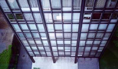
A downward view of the apartment
tower.
The walls of the towers are completely glass, segmented only by steel columns. The effect is that the inhabitants have an entirely unobstructed view of Lake Michigan. |
|
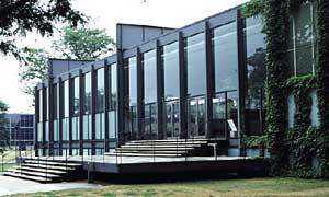
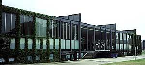
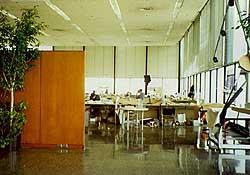
Suspended Roof ("Clear Span Buildings") Mies envisioned a building that provides the complete flexibility of arrangement. And his solution was the truss construction with a suspended roof, clearly a progression of his previous structures that relied on a steel skeleton for support. This design creates a vast hall-like structure, entirely free of internal columns. The roof is suspended from a system of trusses, supported by outside columns, and leaving the interior entirely unobstructed. Reducing a building into its simplest form, basically a large space enclosed by the horizontal roof and the vertical outer glass shell, this design achieves a unity of spatial, aesthetic, and technological organization. Whereas the German Pavilion relied on non-load-bearing walls that were planted into the ground to segment the space, this new structure makes them completely obsolete, as the interior walls were moveable for an arrangement with infinite possibilities. Extremely versatile and modern, the construction can be used for school buildings, theaters, or business purposes. |
|
In the clear span buildings, the primary
structure, the enclosing shell, is clearly expressed and separated
from the secondary structure, the space-defining elements. The individual
experiences the plurality of the spaces as well as the singularity
of the total space. It is a logical path for the evolution of Mies'
designs; the clear span buildings use none of the interior supports
as in his early courthouses, while still maintaining the airy and
spatial feeling. This same mentality will also translate to Mies'
designs for homes, or glass houses with a steel frame, that allow
for an uninterrupted view of the natural surroundings.
|
Steel-Frame with Glass Curtain
|
The next logical step in the evolution of Mies van der Rohe's vision would be a new type of office building, inspired by the steel-and-glass apartment buildings. Mies utilized the steel skeleton frame because he believed it to be a structural system that could provide a maximum of unobstructed floor space, and consequently flexibility for the planning of the offices. After the structure was clarified, Mies turned to the details of the buildings. Again, the rhythmic patterning of the steel columns that make up the facade is evident in Mies' business buildings. |
|
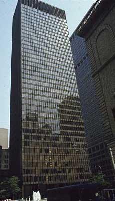
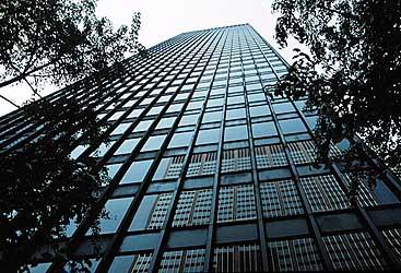
The Seagram Administration Building, 1954-1958, designed in association with Philip Johnson, is an example of the incredible yet modest steel-framed offices by Mies van der Rohe. The 39-story tower on Park Avenue, New York, is set back 90 feet from the Park Avenue building line, and soars above a plaza bounded by three streets. Two pools with benches were included in the plaza. Interestingly, the clever positioning of the building detaches the tower from the frantic pace of the surrounding. And the openness of the lobby lightens the visual weight of the mass above by allowing the city space to flow through at ground level. The steel frame of the structure is enclosed above a 24-feet high lobby, using materials as granite slabs for the floor, travertine around the elevator lift shafts, and bronze as an encasement for the columns. The sides of the Seagram Building is covered by a curtain wall of bronze and bronze-tinted glass, with steel columns set 28 feet apart, with 6 window units between each column. Each office floor is 9 feet high, with partitions for the space arranged behind the mullion. |
|
The steel columns that support the
building are set 28 feet apart, encased in bronze, with 6 bronze-tinted
glass window units in between. The changing color of the glass with
the bronze-encased steel columns is especially brilliant during certain
times of the day.
|
For his commercial designs, after decades
of reflection, Mies referred back to one of his central dogmas:
timeless buildings that embody the spirit of the times.
|
Mies van der Rohe died in Chicago, Illinois
in 1969, but his influence on the modern city is tremendous and still
palpable today. In large cities like New York, Seagram-copycats come
a dime a dozen; buildings like CitiBank, the LVMH Tower, and twin towers
of the World Trade Center reflect the type of simplicity and lucidity
that Mies sought, not to mention their glass and steel facades. It is
even possible to claim that the airiness and modernity of the German
Pavilion somehow influenced Frank Lloyd Wright's Solomon Guggenheim
Museum (1956) on the Upper East Side of Manhattan. In Richmond,
the City Hall building could very well be inspired by the Lake Shore
Drive Apartments, with their gridlock concrete skeleton and rectangular
glass windows. Mies also left direct impact on his contemporaries, including
his protégé Philip Johnson and other architects like Pierre
Koenig. Outside of the architecture world, Mies' popularization
of simplicity and minimalism has also left a tangible effect on fashion,
from such designers as Calvin Klein and Tom Ford for Gucci.
|
Like most of the truly talented architects,
Mies designed buildings for most of his life, from 1908 until 1958.
Unfortunately, most of his designs never extended beyond their paper form.
However, from his prolific career, and the wide range of structures,
one begins to understand the dictum that he made so famous,
that "less is more," and realize his tremendous impact on modern
architecture.
sources:
|
German Pavilion in Barcelona http://www.appfa.auckland.ac.nz/virtualtour/barcelona/kolbe/figures/peterkolbe.jpg http://www.modern-classics.com/pics/barc.jpg http://www.miesbcn.com/images/marcad.jpg http://www.miesbcn.com/images/2Aerea.jpg http://www.miesbcn.com/images/Plantas.GIF |
Lake Shore Drive Apartments http://members.aol.com/richpat/860/twobldgs.jpg http://members.aol.com/richpat/860/lobby.jpg http://members.aol.com/richpat/860/entrance.jpg http://members.aol.com/richpat/860/downvw.jpg |
|
Crown Hall at ITT http://www.bc.edu/bc_org/avp/cas/fnart/fa267/mies/crownhall03.jpg http://www.bc.edu/bc_org/avp/cas/fnart/fa267/mies/crownhall02.jpg http://www.bc.edu/bc_org/avp/cas/fnart/fa267/mies/crownhall5.jpg |
Seagram Building http://www.bc.edu/bc_org/avp/cas/fnart/fa267/20th/seagram9806.jpg http://www.bc.edu/bc_org/avp/cas/fnart/fa267/20th/seagram9802.jpg http://www.bc.edu/bc_org/avp/cas/fnart/fa267/20th/seagram9803.jpg |
