The
Evolution of Colour in American Comic Books by Robert
Lupton
|
For many young Americans, the colourful
world of the superhero comic provides relief from the grey
world of school, homework, and chores. However, the world
into which the youngsters escape has changed from generation
to generation. In the original DC comics of the 1930's and
1940's, colour tended to be eye-catching and unrealistic;
just look at Superman's vibrant red, blue, and yellow costume
(though there were exceptions, such as the shadowy Batman
or the grey world of horror comics). As comics began to
take on a more adult audience in the 1970's and 80's, and
better printing processes were simultaneously being developed,
comic book colouring became more artful. Rather than having
brightly-costumed superheroes perform their elaborate dances
on flat planes of colour (sometimes simple backgrounds were
sketched in, but they were almost always coloured with one
flat shade, usually a blue-grey that wouldn't take any attention
away from the action), a new generation of colourists became
acutely conscious of colouring as a device that could establish
mood, character, depth, and dimension.
|
|

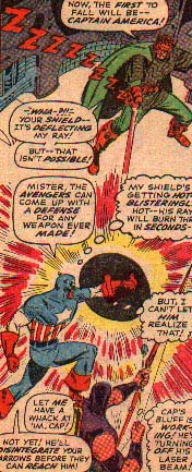
From Avengers #34,
November 1966
|
By the middle of the 1960's, the colour
of American comics was virtually indistinguishable from
thirty years earlier. Though advances were being made in
the printing industry, the comic book industry's "turn
'em out" philosophy prevented any real artistic strides
from occurring. Single artists, writers, and colourists
worked on half a dozen or more books per month, the sheer
volume of work they were called upon to produce preventing
them from concentrating too long on any one aspect of the
process.
Perhaps due to the time constraints on
writers, colour choices were made on the fly, and if they
had any narrative import, it was cursory at best. In the
example at left, one can see this in action. In a panel
like this, individual colours are so intense that they cancel
each other out; the artist obviously hasn't put enough thought
into the work to realize that a more deliberate use of colour
would have been more successful. For instance, the red beams
of light that result from the impact of the super-villain's
laser blast hitting Captain America's shield would have
been more intense on a field of black, as a black background
makes red seem more saturated. If the artist's intention
was to create a colour scheme that emphasized the chaos
of battle, his choices were brilliant; however, if he was
attempting to focus the viewer's eye on the locus of action,
i.e. the laser hitting the shield, he could have been more
successful.
One can also find some degree of significance
in the characters' costumes. Captain America, created during
World War Two, wears the colours of the country that he
protects, but Hawkeye's bright purple fatigues would do
little to camouflage him from a potential assailant (at
least in a world with a palette as earthy as ours). In general,
the heroes of the stories were clothed in bright, vibrant
colours (Spider-Man, Superman, The Flash, etc.) while the
villains tended to be rendered in earthy browns and greens
and metallic greys (Doctor Octopus, Fing Fang Foom, et al).
This dichotomy set up the battles in comics as not only
good versus evil, but the world of excitement and colour
resisting mundacity and boredom. However, these were only
general patterns and rules of thumb, subject to the whims
of creators and editors.
|
|
One other issue that must be noted when
discussing comics before 1980 is censorship. After the publication
of Dr. Fredric Wertham's Seduction of the Innocent (a
book that linked violent comic books with juvenile delinquency),
the comic book industry was forced to police itself, eliminating
violent and mature content from its books. The Comics Code
Authority was a group created to perform this function,
and adopted a set of typically bizarre rules and regulations
that would presumably foster more desirable qualities in
America's youth. Predictably, most of the standards deal
with the content of the story, but the Comics Code's standards
did have some effect on colouring. The most egregious example
is General Standard A7, "Scenes of excessive violence
shall be prohibited. Scenes of brutal torture, excessive
and unnecessary knife and gun play, physical agony, gory
and gruesome crime shall be eliminated." In practice,
torture, physical agony, knife and gun play, etc. were all
present in comic books, but the Comics Code Authority refused
to place its seal on any comic where blood appeared red,
forcing colourists to find creative ways to convey the fact
that it was blood the penciller was drawing. Similarly,
the stipulation that "Nudity in any form is prohibited"
didn't really eliminate sexually suggestive material in
comics, but forced artists to find their way around the
most explicitly detailed infractions. Though nude women
didn't appear in comics, more often than not female characters
wore skintight spandex costumes whose only real differentiation
from the nude body was its bright colour. At least in regards
to these regulations, the artist who produced the black
and white line drawings had little to change in his technique,
and the responsibility of complying with the code fell to
the colourist, who had to present the artist's work in the
most innocuous context possible.
|
|
By the 1980's, however, the tide was beginning
to change. With the success of independently produced comic
books such as the phenomenal Teenage Mutant Ninja Turtles,
many of the old industry rules became antiquated. Since
the new, edgier independent comics were sold almost exclusively
in specialty shops, their publishers had no real reason
to submit their work for approval by the Comics Code Authority.
Secondly, since many of the smaller-budget comics couldn't
be printed in four colours because of cost constraints,
they simply printed the black and white line drawings as
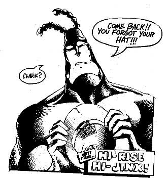
finished work. Before long, black and white comics such
as The Tick and Teenage Mutant Ninja Turtles (both
of which spoofed the superhero genre that was the major
publishers' bread and butter) made a lack of colour an asset,
and more mainstream comics seemed pedestrian in comparison.
Finally, with a significant market share, independent publishers
could now lure top creators from the two major publishers,
Marvel and DC, making artistic freedom a viable issue. Though
smaller publishers still couldn't offer very much money,
they could offer a smaller workload, ownership of
any characters the artist created, and total artistic license.
On the other hand, with toy lines, movies, and cartoons
constantly in production for the major companies, the comic
book version of any given character couldn't differ significantly
from the version in any other media, effectively restricting
creators from anything other than subtle changes in their
characters' appearance or personae.
|

New England Comics' The
Tick, one of the most successful independents.
|
| Of course the major publishers
weren't about to begin publishing their books in black and
white, so some small advancements in the technical side of
the colouring world were made. The number of dots per inch
that could be printed were increased dramatically, resulting
in a larger palette and subtler gradients. However, before
any really noticeable reforms took place, the post-Reagan
recession took hold in the United States, wiping out virtually
every independent comics publisher. Even the almighty Teenage
Mutant Ninja Turtles couldn't survive the economic downturn,
becoming a nonentity for nearly a decade. |

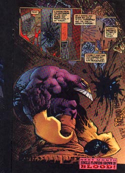
Image Comics' The Maxx
|
During
the recession, the major publishers had as many economic
problems as the smaller publishers, and new methods had
to be found to promote the books, especially to the specialty
audience that had solidified during the 1980's. One of the
publishers' solutions (Marvel Comics in particular) was
to hype not only the characters and stories featured in
the books, but the creators as well. Though virtually no
one paid attention to who created a comic book twenty years
earlier, every comic fan had a favourite writer and artist,
and rather then being a lifelong fan of a character, fans
now dedicated themselves to creators, following them from
book to book. Soon, most creators (artists in particular)
were forced to produce only one book per month, and received
outrageously large salaries for this significant drop in
production. However, the effect was that comic books became
much more artful as creators had more time to devote to
them. Unique panel arrangements, detailed backgrounds, and
progressive plotlines that would have been unheard of years
ago were now commonplace. The only problem was that creators
enjoyed this artistic freedom so much that they began to
feel constrained even by the newly undemanding editorial
staffs at the large publishers.
In
1991 seven of Marvel's top creators left to start their
own company, Image Comics. Though the split with Marvel
was ostensibly due to the fact that the artists had to relinquish
ownership of the characters they created, there were countless
changes in this new line of comic that would revolutionize
the industry.
|
|
First of all, the new Image comics lacked
the Comics Code Authority's seal of approval. While some creators
dealt with adult topics that would not have pleased the Comics
Code, and some just wanted some good old fashioned gore, no
one particularly wanted to have their newly unhindered artistic
vision censored by some antiquated, irrelevant organization.
Secondly, in a decision that would forever revolutionize the
way that American comic books are coloured, Image comics decided
to hire an outside studio to computer colour all of their
comics. Also, rather than merely printing the cover on high-quality
paper, Image collectively decided that the entire comic should
look as great as the cover. Whereas computer coloring wouldn't
have done much for the pulpy newspaper stock that Marvel and
DC were still using for their inside pages, every drawing
in an Image comic could be viewed as a work of art in and
of itself.
Note the example from Image Comics' The
Maxx above. This mature sense of colour would have been
out of place in virtually any comic of an earlier time period.
Rather than simply using a single light source that lights
the figure, the main panel features a harsh light source that
is focused just to the right of the figure, and the blueish
tint of The Maxx's back betrays a subtle second light source
behind the figure. Both this subtle lighting scheme and the
printing process that allowed it to be illustrated so effectively
were nothing short of revolutionary, and lend an air of realism
even to penciled artwork as overtly stylized as that found
in The Maxx.
The large publishers raced to catch up with
Image, who were quickly eating into the large market share
that Marvel and DC had enjoyed during the recession. However,
as virtually every comic switched to computer colouring at
nearly the same time, there weren't enough colourists to meet
the demands, and there was a great deal of on-the-job training.
Gary Scott Beaty notes that "coloring was getting out
of hand. Every bump was formed with a grad, every belt buckle
had a lens flare and every strand of hair was 3D. In my opinion,
it took a while for the initial excitement of what COULD be
done gave way to a real assessment of what SHOULD be done.
I admire the painterly approach, as long as the basics of
painting are applied. Much of that early 1990s stuff ignored
(A) where the light was coming from, (B) shaping the figure
instead of hiding it and (C) separating foreground from background."
Another reason for the wildly inconsistent nature of comic
book colouring of the period was the lack of editorial control;
both Image and the major publishers outsourced their computer
colouring to studios like Steve Oliff's Olyoptics, who did
their own quality control work. An editor's only real solution
to a poor colouring job was to have the book redone, which
is almost completely unfeasible for the comic book industry's
rigorous publishing schedule.
In today's booming comic book industry, all
of the trends in colouring have pretty much leveled out. Virtually
all large print-run books are now computer coloured, but the
"kid with a new toy" aesthetic is now pretty much
gone. Comics are now coloured artfully, and with a conservative
sense of style rather than blatant flair. Black and white
comics are still largely out of the mainstream, but a few
artists have demanded that their high-profile projects be
published without colour, restoring the air of respectability
to one-colour fare. Also, the Comics Code Authority is quickly
losing any last shreds of influence, as the number of comics
sold on newsstands rather than specialty shops dwindles ever-toward
the zero mark. The progression of comic book colouring is
likely not over, though. Constant strides in the domain of
computer software and process printing will allow colourists
more and more freedom, and even if we have seen the last "revolution"
of comic book colour (and likely we haven't), like any other
art form the medium will continue to evolve. As pop art, comic
books, and their colour in particular, will always be a gauge
of the American social consciousness and aesthetic, and beyond
their interest as a lively art form, they will always be important
because they are the world into which we choose to escape.
Selected Bibliography:
http://www.comicartistsdirect.com/coloring.html
- A concise history of colour in American superhero comics,
if a bit on the technical side.
http://www.dccomics.com/ - DC comics has been
around for more than 60 years, and the the images on their
web site will explain to these concepts to the newcomer in
terms we all recognize: Superman, Batman, the Flash et al.
http://www.cbldf.org/history.shtml - A short
history of censorship in comics penned by the folks who wish
to abolish it, the Comic Book Legal Defense Fund.
http://www.geocities.com/Athens/8580/cca.html
- The original standards used by the Comics Code Authority
to evaluate comics. An interesting piece of history, but disturbing
when one realizes these standards are still being enforced
today.
|
|