|
Picture 1:

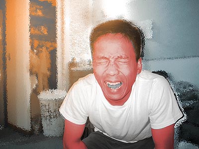
Hitasha Singh: In this
picture you appear to be either crying or
screaming. The coloration of the face really gives a sense
of anger,
which makes me think the subject in the picture is frustrated. The
fire in the background increases this sense of frustration. It's
like
the room is on fire and you're trying to escape it. Or perhaps
you're
trying to escape whatever it is that's frustrating you.
Stephanie Jellison: You look like you're very angry because you
appear
to be yelling or screaming. Overall the picture looks very
intense,
with the orange in the background. Is that fire? That's
what it
looks like, like the room burning. But you're not trying
to run out
of the room. You're sitting down. So maybe the
orange fire is
symbolic of trying to escape the fire inside....something like that.
David
Ward: The red face and bright orange in the background really gives
this picture a sense of urgency. The tongue is odd, but the overall
effect remains the same.
|
|
Picture 2:
Hitasha Singh: the coloration of the faces in this picture is
interesting. You look deathly pale with the gray face and
dark blue
lips. But it give the picture a sense of irony; you look
so dead yet
you're smiling and you're a restaurant. Your friend in the
picture
looks like he just ate something really spicy and his head is about
to
blow up. The use of color here is simpler than in the first
picture
but it changes the picture of the picture.
Stephanie Jellison: This picture is both funny and
morbid, mainly
because of the use of color in the faces. You, on the left,
looks
lifeless because you're colored gray with blue lips. The
guy on the
right, however, looks surprised. Maybe he's embarrassed? His
face is
deep red. Or maybe he ate a spicy pepper and is crying for
water.
David
Ward: The deathly blue lips and dark face of the guy on the left
is well done,
but why aren’t his arms colored too? Maybe you’re just trying to contrast
his face with
the red face of the guy next to him. The guy with the red face looks
surprised but the
meaning behind his expression might be changed with the color red. Now
it looks as
if he just ate something and is asking for help - water maybe?
|