Cityscape2 Assignment

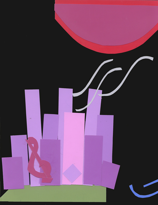
This is the second version of the cityscape assignment combining rectilinear and curvalinear shapes in a design. This 2nd version was created in response to a class critique of the initial design. Suggestions were made to limit the amount of negative space on the right hand side of the picture in the first cityscape design. To do this, I added some blue curves to suggest that the city sits near the water. Another suggestion was to make the moon seem larger than it appears in the first design. Finally, a suggestion was made to make the musical note more obvious than it appears in the first design. The cityscape image above represents all class suggestions. I still visually like the first version best, but you can choose for yourself which you prefer.

